

Human form at
its most basic.
cult.fit’s logomark is made with symmetry & balance in mind & captures the very essence of what it stands for & hence it is sacrosanct in its form and construction which cannot be altered. Devoid of any frills, adorned with soft rounded edges, the form connotes inclusivity, friendliness and warmth. It’s circular completeness expresses cult.fit’s commitment to holistic fitness. The bright, colourful radiations that originate from the core, symbolise boundless and contagious energy, that flows out into the world.
The roundness derived from the logo mark, makes the logotype feel inviting & warm. Its stylised serif form makes it look contemporary while being ready for the future. Lowercase letters create balance while capturing the sweet spot between friendliness and professionalism. Do not try to recreate the logotype for any reason. Always use the unit from the master vector artwork.
The proportional and calculated spacing of the vertical version of the logo aids symmetry and visual balance between the cult.fit logomark and logotype.
A clean space helps highlight the logo, giving it greater prominence & define the exclusion zone around the logo. This is calculated by using the letter “c” of the logotype.

brand colours.

Black

White

Yellow

Blue

Pink
brand gradients.

Golden hour

Daylight

Midnight
status colors.

Positive

Neutral

Awaiting

Error
task-focused.
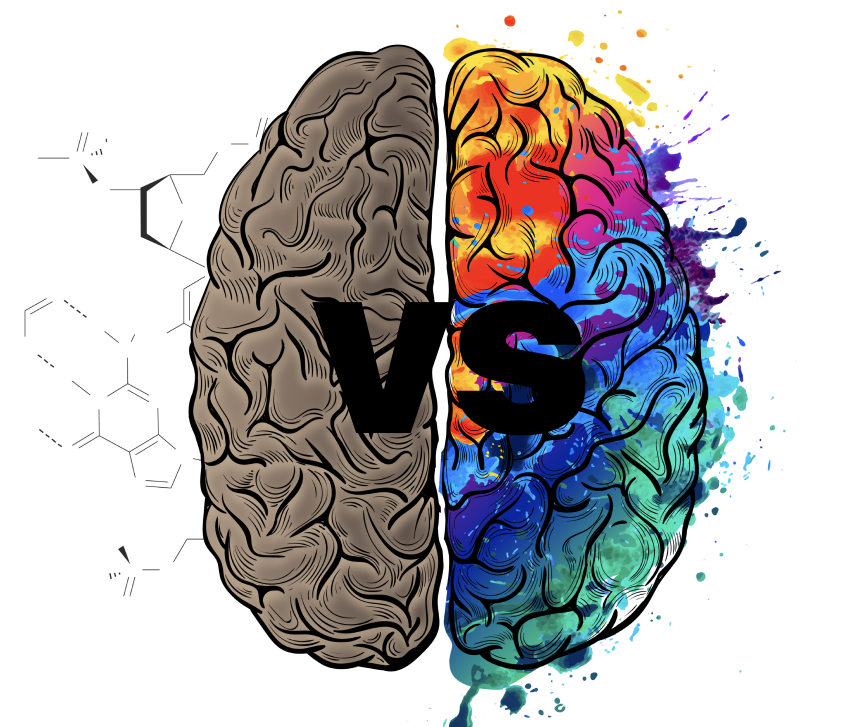
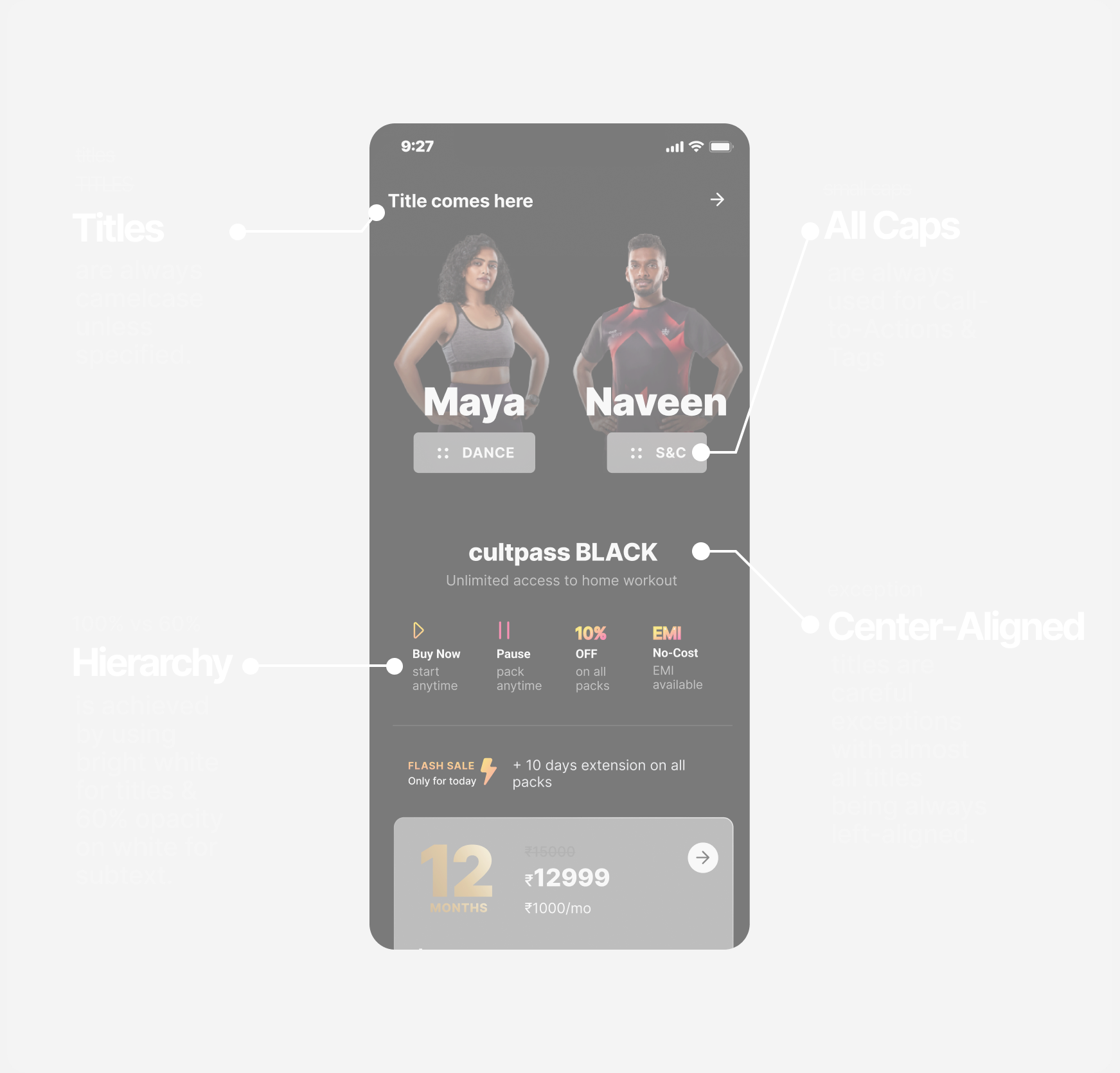
typography leverages textual hierarchy & contrast to make comprehension lightning fast & cognition seamless.
emotive.
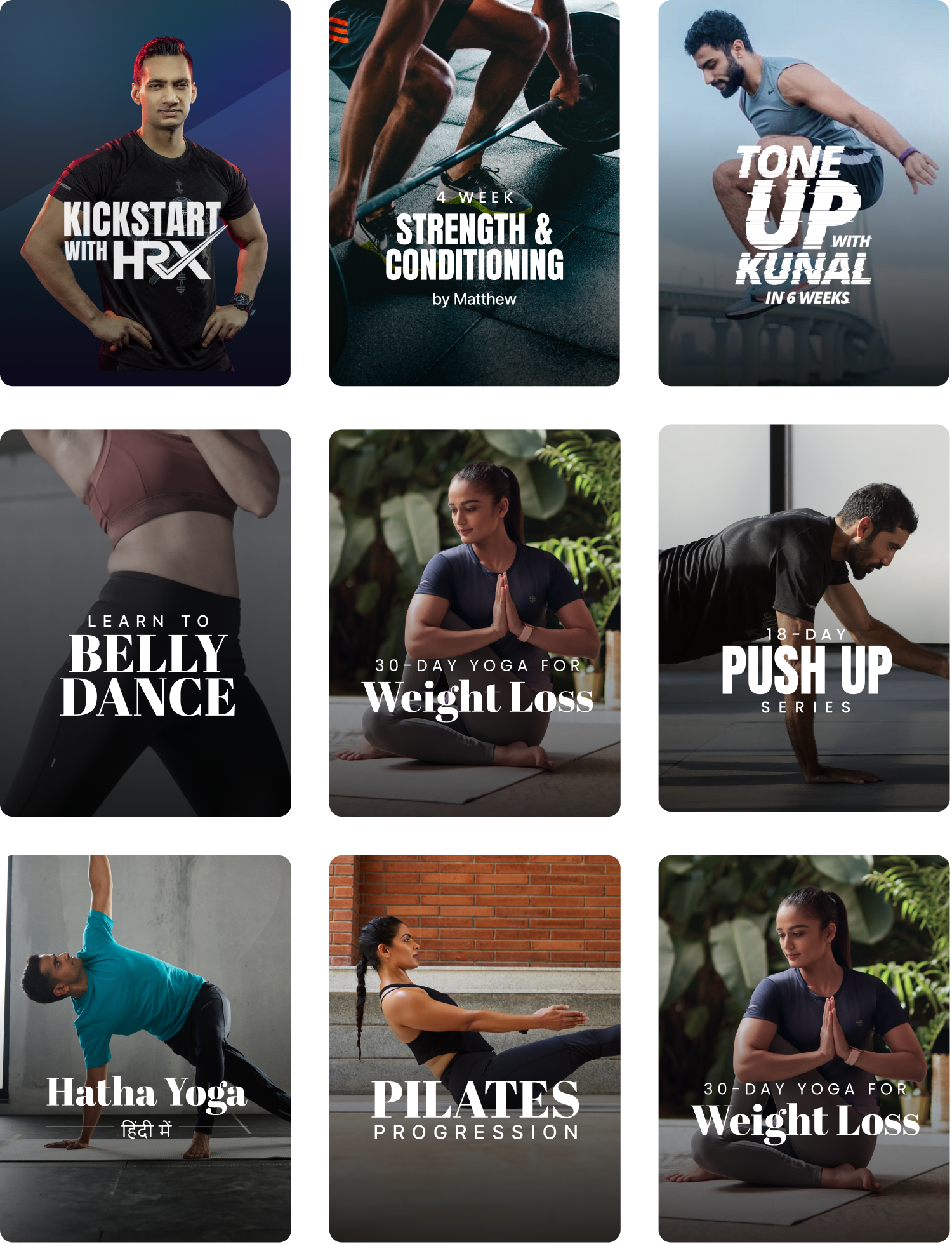
typography provokes an emotional reaction from the users that communicates the content in an enticing manner.
task-focused.
emotive type.
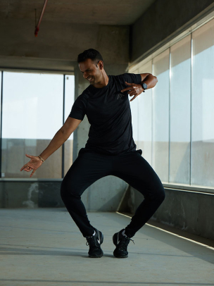
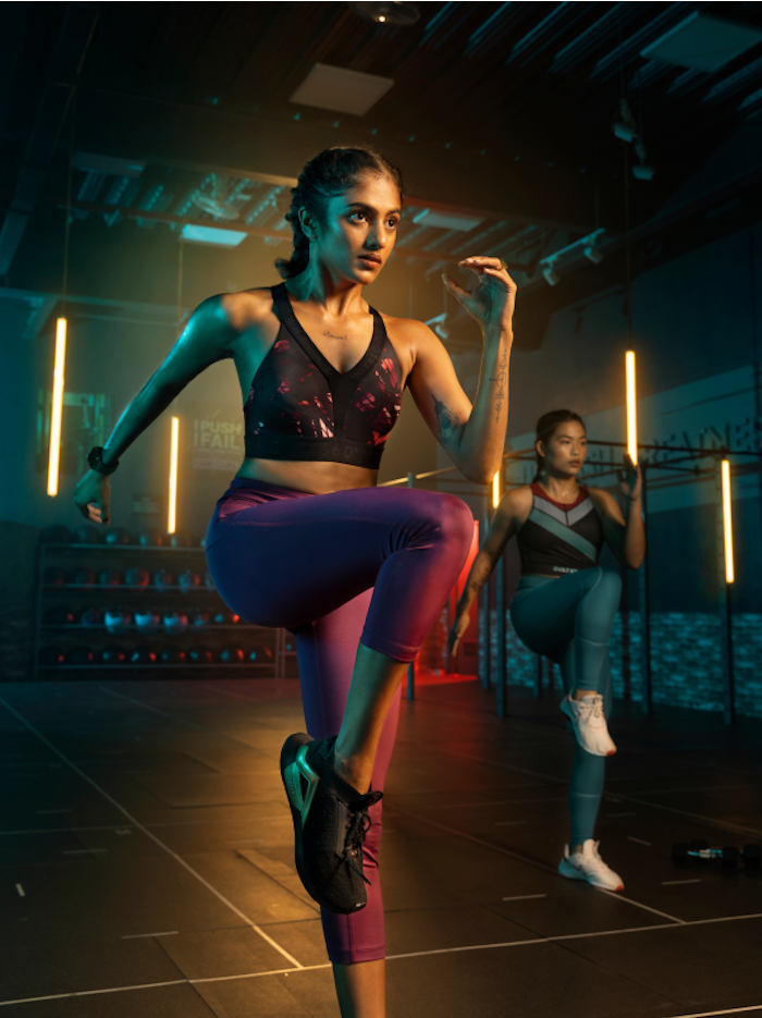
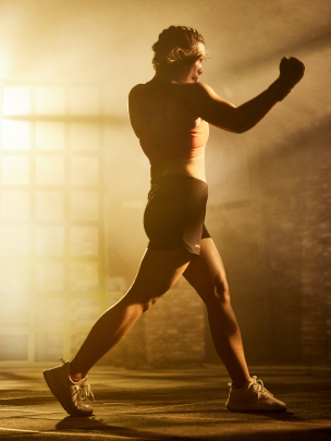
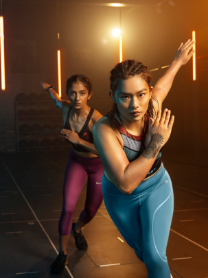
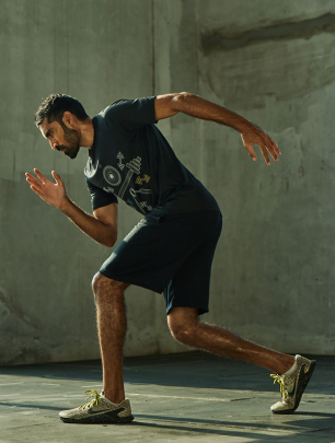
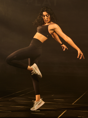
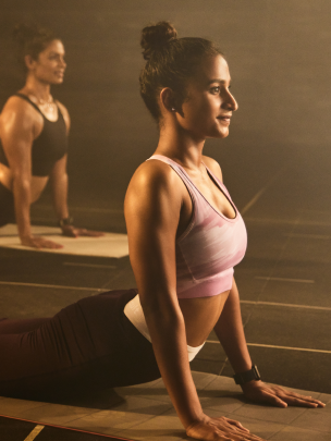
We don’t capture great photographs, we capture moments that are real, bold and energetic.
bold.
real.
energetic.
- Play of light and shadow should elevate the subject’s body form.
- Create depth and contrast between subject and background.
- Lighting should not be flat or over done.
- Images to be shot in action.
- Postures and body language should never feel posed.
- With celebrities, shots with them looking directly into the camera would be preffered.
- Be inclusive, shoot with real athletes, trainers and experts from varied backgrounds.
- Don’t shy from taking close-ups that focus of body form or expression.
- Avoid cluttering the background with props, keep it minimal to drive focus on the subject.
- Images to be shot in action.
- Lighting to feel natural and elevating the body form.
- Ample contrast between subject and background.
- Creative play with camera angles and layouts.
- Don’t shy from taking close-up shots that focus of body form or expression.
- With celebrities, shots with them looking directly into the camera would be preffered.
- Mood and vibe of imagery should never feel static, posed, low energy, flat or stockish.

Themes
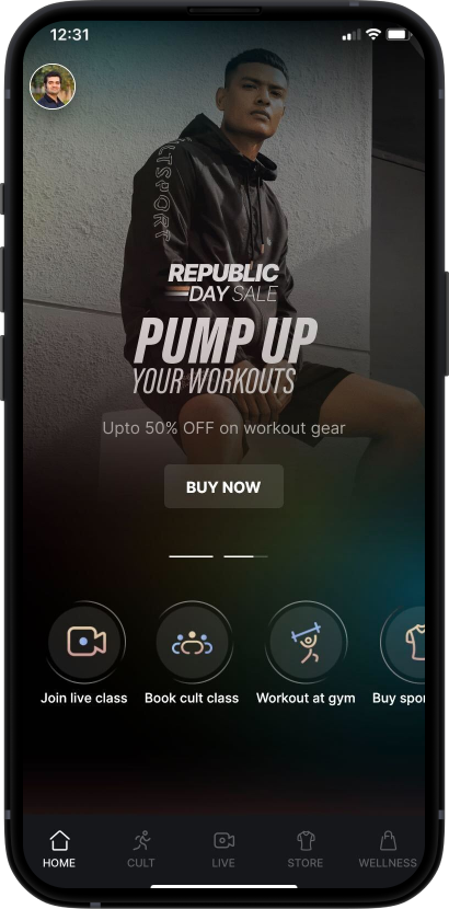
Classic.
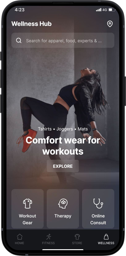
Earthy.
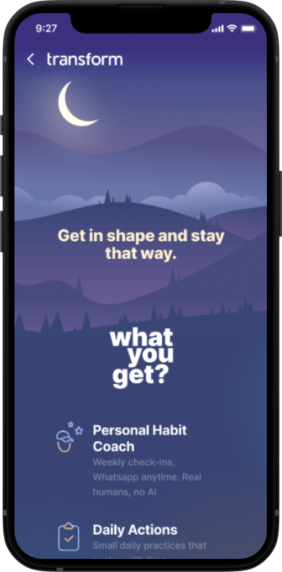
Night time.
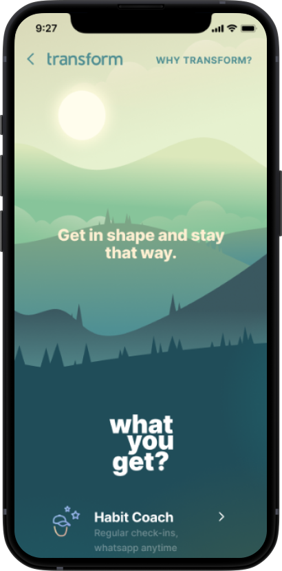
Day time.

Grids &
Spacing
Spacing Scale
We use a limited number of spacing values to design a consistent interface. The spacing scale lives as a list of constants in tech affording us ease of implementing it at scale.
Mobile Grid
We use a 12-column grid for mobile form factors which allows us to use any number of elements in a row. The grid also provides a consistent scaling framework of the interface on different mobile screen sizes.
Vertical Spacing
We use a 12-column grid for mobile form factors which allows us to use any number of elements in a row. The grid also provides a consistent scaling framework of the interface on different mobile screen sizes.


